How to plot social circles in Cellebrite Pathfinder’s investigative analytics solution

In this week’s Tip Tuesday, we explore investigative analytics features within Cellebrite Pathfinder to show how to plot social circles within. See a visual representation of communications to easily find the connections between different parties.
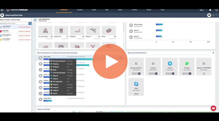
Start with the dashboard where you can see ‘Top interactive parties’. Click ‘Go’ on a name and the owner’s main connections will be listed in different numbers on the left sidebar. Click on one and you will enter a chat view.
Going back to the main dashboard—you can proceed to ‘Most Interactions on Multiple Communications channels’.
Click ‘Filters’ and adjust the number of events. If you have a specific number, you can really hone in on different people and connections.
Manipulate the additional settings to show you exactly what you want to see in your correlation.
This makes the spider web of investigations easier to digest and helps you understand who is communicating with one another.
Watch the video for more details.
